
Photography
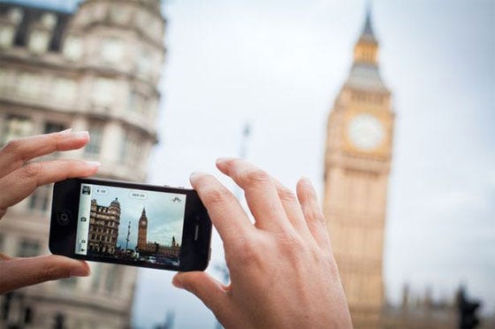
When analyzing the list of summarized photography tips, the last point of photographers intentionally break many of these tips stood out, as you need to consider both the story your telling to tell but also, deciding which rules need to be broken. Sometimes the most chaotic photos with the busiest backgrounds can be the best photos. It also depends on what you are photographing, since understanding if background figures or buildings are important along with photography people. Photography can sometimes be simply taking a photo without adjusting any settings or lens, but when you alter those settings, such as fin tuning the lighting and adjusting a lens, photos will look better. Therefore, by breaking these rules, photos will be able to tell bigger stories and have larger impacts.
Concepts from Reading
All photos can tell a story about anything–from a period in history to a core family memory. Facial expressions and body language play a role in this as they justify emotions and visually describe a moment in time. Lighting and angles are important because we tend to connect darker colors (black, white, gray, etc), with sadness while colors like red and orange are connected towards anger. Angles reinforce an underlying tension within a background or setting, as they can communicate happiness when balanced but at different angles, it becomes more up to interpretation. This is all intertwined into composition and framing of both the photographer and the resulting photo.
Visual Storytelling–What I Learned
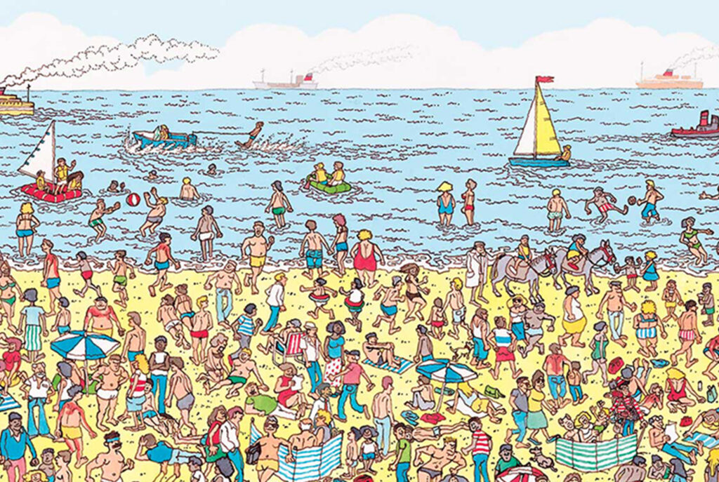
The game hide seek aligns itself with visual storytelling because in the game, you are looking for a person who doesn’t fit into the environment of a pre-existing space. This applies to visual storytelling as they both follow a similar objective of making a photo, or space, altered in a way that enables further thinking and reflections towards understanding why certain choices were made. In the case of hide and seek, there is a lack of emphasis on the altering of a space in order to stay hidden, but in photography, these changes are very purposeful in order to challenge the viewer. The image above is an example of this, as it the viewer,it’s just a drawing of a beach, however, when you look closer, you will see Waldo in the far right corner. In conclusion, photography is truly an art that once mastered can really add meaning to anything
The Vignelli Canon Reflection
When reading The Vignelli Canon, one of the concepts that really stood out to me was this argument against brands marketing who lean onto vulgarity and crude design, simply for the benefits of mass consumerism and profit over originality and intentional design choices. In the book, it’s even implied that minimalism is employed as a defense mechanism against efforts of proper semantics. I found this claim very appealing because of the depth of it’s overall meaning. In modern times, we are very focused on the singularity of objects and what makes them special, over actual thought-out choices that make the design funner, and more complex. My audio below is a nod to the marketing bands who believe being basic is better.
The aspects that I found most useful from this reading included this idea of discipline and white space. For discipline, I found this interesting as a way to describe photography. Sloppiness and tendencies to rush photos in an effort to be transactional can often lead to the worst of photos when attention to detail is dismissed. I also took as a reminder to be patient when taking photos and to “not do it just to do it”. White space comes into play with photography because of the urge to zoom in and focus on singular objects over it’s surroundings. While the author focuses on typography within the literary space, the same foundations apply when navigating the usage of negative space in photography, as they both strive to build tension from tight framing and limited blank, empty spaces. It can be easy to default to big, open white spaces to add suspense, yet it actually dismantles that and adds a space of relief over tension. In conclusion, these accepts where the most useful to me as they both provided structure towards an art that is rather complex.
When reflecting on the principles discussed throughout the reading, the one’s that I would likely apply towards my work included scale, texture, and color. We can manipulate objects, lighting, and angles to achieve a certain expression and help to persuade a viewer to have a perception of said piece of art. Within this, color can be used to communicate emotions and work as an identifier, especially for branding symbolism. Scale applies to the impact of the angles chosen for something, as the closer something is, the more depth it has over being viewed from farther away. Texture comes into play primarily when considering lighting, as it can also enhance these principles by providing further texture to object when lighten up. Therefore, all of these principles are extremely useful towards photography and any other work I may do in the future.