Balance
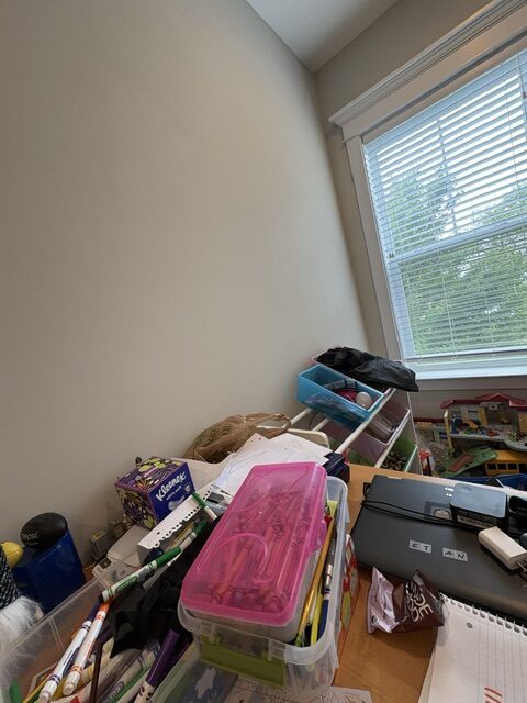
The image above is an intentionally bad example of the design concept of balance. At first glance, this photo is asymmetrical and unstable due to it's 0.5 angle. Along with that, the pink and green handled bin are positioned as if they could fall off at any moment, creating tension. This photo was taken to purposely fail to comply with this design principle because of it's uneven elements and caustic background, making it impossible to focus on one object due the clutter. It's discombobulated nature adds to the overall confusion of the purpose of this photos creation.
Form, Function, and Message
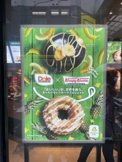
This advertisement for these two donuts is highly effective in communicating it's message because of it's usage of both visuals, brand logos, and overall design. The featured donuts are placed in the center of the top and bottom of the ad, and are enlarged, making them the forefront of the ad, and almost impossible to not see and understand what is being advertised. Along with that, the sizing of the background fruits of pineapples and bananas enable consumers to understand that these are the flavors at hand because of their placements being solely next to one of the donuts, not both. However, one of the major takeaways is that even if you don't understand Japanese, you can still quickly decipher what it's communicating through it's visuals, which adds to the effectiveness. This further enchances the placement of the text, because of its middle location, you can almost ignore them and only look at the visuals.
Dominance
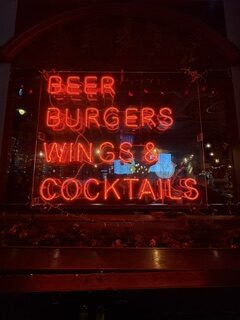
When considering the design concept of dominance, something that must be considered is which elements draw you in the most. This image reflects that because the upper cased, neon light words are extremely noticeable and explicitly simple. It guides your eyes in the same way one would read a book, as you read them top to bottom. There is no background imagery or additional visuals that prevent you from doing so, which makes it very effective. Therefore, this image is a great example of how simplicity can make domaince an effective concept, when designed correctly.
Proportion
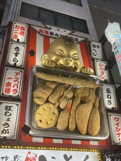
The image below is an example of proportion because of it's reflection of size relationships. Based on the angle of this photo, it's evident that it was taken at ground level, since you cannot make out the bottom half the sign, and everything is at a slight left angle. The scale at which this was taken is reflective of these observations due the height of the visuals themselves. When looking at the fake foods themselves, and the baby holding the tray, proportionately they stand out more then the columns due to the larger scale and size, making them almost shocking to look at. Lastly, The scale at which this takes up is very visually appealing, since ti was taken to showcase the visuals above.